SelfMadeHero New Season Autumn 2025
16 May 2025
Dear SelfMadeHero readers,
Thank you all for your steadfast support in what is already proving to be a most unpredictable year! Amidst all this chaos, now comes a moment of clarity (or at least something to look forward to): our list for Autumn 2025!
Thank you all for your steadfast support in what is already proving to be a most unpredictable year! Amidst all this chaos, now comes a moment of clarity (or at least something to look forward to): our list for Autumn 2025!
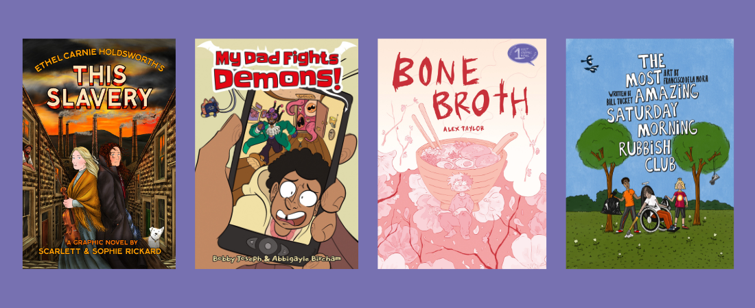
- This Slavery by Ethel Carnie Holdsworth, adapted by Scarlett & Sophie Rickard.
- My Dad Fights Demons! by Bobby Joseph and Abbigayle Birch.
- Bone Broth by Alex Taylor.
- The Most Amazing Saturday Morning Rubbish Club by Bill Tuckey and Francisco de la Mora.

You likely already know the Rickard Sisters for their previous graphic novel adaptations of literary classics No Surrender and The Ragged Trousered Philanthropists. This year they are reviving This Slavery by feminist trailblazer Ethel Carnie Holdsworth, the first female working-class novelist to be published in Britain.
When the Lancashire cotton-mill that employs them burns to the ground, sisters Rachel and Hester Martin are each forced to find their own way to survive in the harsh realities of pre-war industrial Britain. The contrasting paths they take in their quest for domestic autonomy form a subtly strident allegory of the all but insurmountable barriers of class and gender that then enslaved half the population.
Part compelling narrative epic, part fiery Marxist-feminist polemic, this faithful, sumptuous, and revelatory adaptation by the award-winning Rickard Sisters reclaims a lost classic by holding it up as a mirror to our own hard times, and as a gloriously flaming beacon to future communities to offer strength, hope, and dignity.
Of No Surrender, Comics Review wrote: “Powerful, enraging, engaging and even occasionally funny, this never-more-timely tale of the force of the disenfranchised with their backs to the wall and ready to fight is supremely readable and should be compulsory viewing for all.”
OUT IN UK: 9th SEPTEMBER! 🇬🇧
OUT IN NORTH AMERICA: 11th SEPTEMBER! 🇨🇦🇲🇽🇺🇲

UK Comics Laureate Bobby Joseph and breakout illustrator Abbigayle Bircham have teamed up to create SelfMadeHero's next Young Adult graphic novel, My Dad Fights Demons!
Welcome to Rye’s world: their stepdad hates them, their mother ignores them, and they’re stuck in a dead-end relationship. To make matters worse, their world is turned upside down one day with the return of their father, the Magical Mr Mantrikz, self-styled “greatest sorcerer in the world”, and Rye now has to spend their weekends with this rude, pushy, and frankly ridiculous wizard. And that was never going to work – especially when magic is involved…
This is Bobby Joseph's first graphic novel since Scotland Yardie (Knockabout Comics, 2017). Abbigayle Bircham was a LICAF Breakout Initiative participant and has been published under Soaring Penguin Press and the Rat Pack Collective.
OUT IN UK: 25th SEPTEMBER! 🇬🇧
OUT IN NORTH AMERICA: 30th SEPTEMBER! 🇨🇦🇲🇽🇺🇲

Winner of the 2023 First Graphic Novel Award, Gen Z Hannibal tale Bone Broth is up-and-coming artist Alex Taylor's debut title.
In this coming-of-age queer thriller, the young transmasculine Ash begins his transition into adult life by landing his first job at a ramen-noodle shop in London, prepping the bone broth. But as the financial landscape shifts under Ash’s feet, and after months of bonding with a series of challenging co-workers, everything suddenly stops dead. Literally. At a drunken staff party, Ash’s bullying boss turns up dead, and everyone’s been taking selfies with the corpse. Good thing Ash has already spent a year on the job…
OUT IN UK: 23rd OCTOBER! 🇬🇧
OUT IN NORTH AMERICA: 28th OCTOBER! 🇨🇦🇲🇽🇺🇲

The Most Amazing Saturday Morning Rubbish Club is a unique collaboration between author (and veteran DJ/broadcaster) Bill Tuckey and illustrator Francisco de la Mora, both of whom are parents of SEND children. SelfMadeHero readers may know de la Mora from the Art Masters titles Frida Kahlo and Diego Rivera.
This graphic novel puts the lived experience of SEND children at centre-stage. Its inspirational storyline appealing to parents and children, tells how three very different kids, each with their different needs and subject to the same low expectations, come to share their own unique skills to achieve their goals. These spirited characters meet in the park and unite to establish a litter-picking scheme. Touching, funny, and beautiful, this unique collaboration is indeed… most amazing.
"It’s a wonderful tribute to both her personal life and her art." — Morning Star on Frida Kahlo: Her Life, Her Work, Her Home.
OUT IN UK: 20th NOVEMBER! 🇬🇧
OUT IN NORTH AMERICA: 25th NOVEMBER! 🇨🇦🇲🇽🇺🇲
***
Thank you all again for your continued readership! We look forward to sharing more details about these titles soon!
The SelfMadeHero Team


